This week for Project Life I've kept it pretty simple again. I don't want to overwhelm myself in the first few weeks of the year with this project. I'm aiming for the victory of getting it done, rather than trying to do too many things with it and spending too much time on it. Between photo processing, picking out photos, printing them out, and doing the journaling cards, I probably spent three hours this week. One thing I actually did was round the corners of my photos and on the digital journal cards I printed out. I thought I would experiment and see if I like having all rounded corners better. Turns out it doesn't matter to me. I actually like having square corners on some photos, especially the ones that are collages. So I think I'll not make it a habit of rounding the corners going forward, since it makes no difference to me and takes time to do. :) Oh and sorry about the photos with glare on the page protectors this week. I was literally on my way out the door this morning and just didn't have time to take better photos.
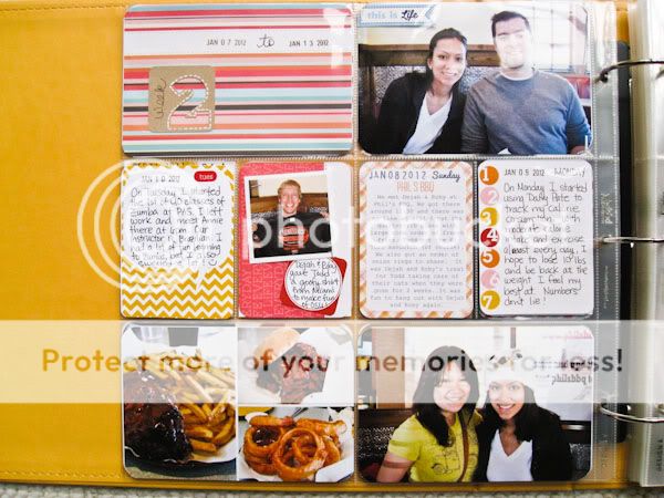
Left hand page: On Sunday we went to Phil's BBQ with our friends Dejah and Roby. Todd had taken care of Roby's cats for a couple of weeks while they were out of town, so they took us out to lunch. They also brought Todd a tshirt back from Miami that makes fun of Ohio State and Jim Tressel. All in good fun!

Once again I used a mix of journaling cards from the Clementine Core Kit and from my digi supplies. I also continue to mix handwritten journaling with typed out journaling from my computer. It doesn't bother me that I don't have a uniform look. The lower left collage I made in Adobe Lightroom. This is the next video tutorial that I'll be working on.
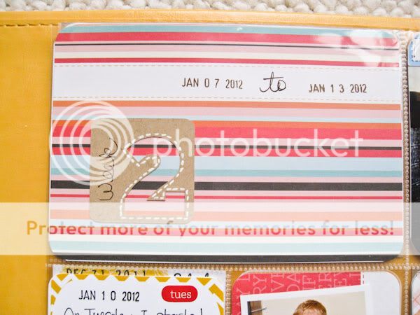
I wanted to do a graphic for which week we're on, so I decided to design a number cutout in my Silhouette Studio software and cut it out on Bazzill kraft cardstock with my Silhouette SD. I used my Signo Broad white pen to draw stitches around the "2" to make it stand out more. I went back to my week 1 layout and did the same thing to the week header pocket page.

Again, a mix of handwritten and typed journaling. The journal card in the middle is from Clementine Core Kit. I typed out the journaling in Photoshop and then printed it out. You can see my recent video tutorial on how to print out computer journaling onto Project Life journal cards here.

I also want to point out that I journaled about starting to track my daily calorie intake on Daily Plate, even though I don't have a photo about that. I'm ok with telling stories in my album that I don't have a photo for, or showing photos that I don't journal about. I just do whatever I feel like at the time. Just remember that it's YOUR album and you can do whatever you want. There are no rules! :)
Right hand page: We hung out with our friends AJ and Meera and their kiddos. Todd made my favorite soup, Tuscan Potato Soup from Cooking Light. It is so yummy! Todd got a new Ohio State Buckeyes long-sleeve shirt and it actually fits! He has really long arms so it's hard to find longs-sleeved shirts that fit.

The labels on the soup photo and above the kid photo are digi products called "Mega Label Pack" by Amy Wolff at The Lilypad. I recorded a video tutorial for the Lilypad blog about printing and cutting digital items using the Silhouette. Those labels were the result of the tutorial.
Close up of computer journaling printed out onto a 3x4 Project Life journal card. Again, you can see a video tutorial on my blog here on how to do that.

I've included the supplies I used below. Can you let me know if it is helpful to you to include the supply list? It takes me a long time to find the images and links, so if it's not helpful to you then I may not include them anymore in the future.
2012 Project Life | Week 2 Supplies:
I also wanted to let you know that I was a guest on The Digi Show this week, discussing point-and-shoot photography tips and phone photography with Steph and Katie from The Daily Digi, and my good friend Peppermint (One Little Bird). I love capturing everyday moments with my point-and-shoot camera and my phone. You can click here to listen!

This was actually my third time on the show. I was on the show a couple of times before it was spun off from The Paperclipping Digi Show.
Here were the previous episodes that I've been on, in case you're interested in the topics.
Episode 032 | I'm Learning So Much Today (about recoloring digital scrapbooking products)
Episode 029 | The Year In Review (about creating year-in-review scrapbook pages)

love the rounded corners!
ReplyDeletethat tattoo and pawn shirt is cracking me up (i'm a buckeye). where did you get it?
ReplyDeleteHi Anna! The Tressel tattoo and pawn shop shirt is from our friends who got it on their trip to Miami, FL. You might want to try googling it to see if it's for sale on the internet?
ReplyDeleteIm really enjoying your blog. However, when I double click on your PL layouts to see closer, I cant get it to do so. Would love to see it closer.
ReplyDeleteI appreciate the comment, I really do. However, all my blog photos are 600px across because I don't feel comfortable sharing larger photos for two reasons. First is some people like to take photos off blogs and claim them as their own. With smaller photos like 600 px across, there's less incentive for them to do so. Second reason is I show my Project Life album so people can get ideas and inspiration in general. It is not my intention to have every single journaling readable for everyone. If I feel like some parts of my page warrants sharing in close up, due to products I used or a technique, then I would take a close-up photo of that particular item.
ReplyDeleteSo that's my answer for now to your comment. I will experiment with maybe upping the photo size slightly, where I'm still comfortable with the size. I can't promise anything though.
I'm so glad you included links to past episodes you've been on. For some reason I didn't listen to those.
ReplyDeleteTotally makes sense about the smaller photos-I always wonder about people claiming them as their own. And for your products, I mainly want to know about your fonts. You could just do a list of those. Thanks for sharing!
ReplyDeleteLove your links to the digital products, I personally dont need the links to the other products. I love your blog and your PL looks off to a great start. Thank you for sharing and cannot wait to see your tutorials.
ReplyDelete